
Mark Rothko, “Untitled (The Subway)” (1937). © 1998 Kate Rothko Prizel & Christopher Rothko - Adagp, Paris, 2023.
1. Scenes from the New York City Subway
In the 1930s, Mark Rothko (1903-1970) started his career as a painter in New York, where he settled after his graduation. The energy of the city fascinated him and inspired his paintings at the time – entrance halls of theatres and cinemas, New York streets and night owls. However, his favorite topic remained the subway stations, which embodied modern life and its massive urbanization according to him. In Untitled (The Subway), we can notice elements that characterize the works from that period, such as the columns, or the vanishing points formed by the platforms and railway tracks framing a space in which passengers are almost prisoners, “as if trapped in the architecture”, as Suzanne Pagé describes them.
The following paintings of the exhibit take up the same theme again, featuring bodies that increasingly stretch out and become slimmer to eventually merged with the columns, like abstract geometric shapes. Influenced by the primitive aesthetic, the melancholic canvas of 1937 already conveyed the passengers’ silence and isolation with its dark, even sad color palette, but also the shadow of the economic crisis that stuck the United States after the crash of 1929.


Mark Rothko, “Slow Swirl at the Edge of the Sea” (1944). © 1998 Kate Rothko Prizel & Christopher Rothko - Adagp, Paris, 2023.
2. Neo-surrealist phantasmagoria
While Mark Rothko’s urban paintings already foreshadowed the orthogonal lines that would later structure his famous abstract canvases, his so-called “neo-surrealist” works of the early 1940s were much more surprising, such as Slow Swirl at the Edge of the Sea. Drawing his inspiration from artists close to the movement founded by André Breton, such as Marx Ernst and Giorgio de Chirico, whom he discovered at MoMA in 1936, the American painter began to imagine pictorial phantasmagorias composed of airy, indeterminate spaces in which free and colorful forms intersect.
Rothko described them as “organisms with volition and a passion for self-assertion”. Judging that he couldn’t paint the human figure without mutilating it, the painter aimed at reaching for a universal in his canvases and creating sensations in the viewer through the pure composition of shapes and colors. Joan Miró’s pictorial influence permeates these compositions, as well as psychoanalyst Sigmund Freud’s theories on the unconscious, for which the American artist used to have a keen interest.
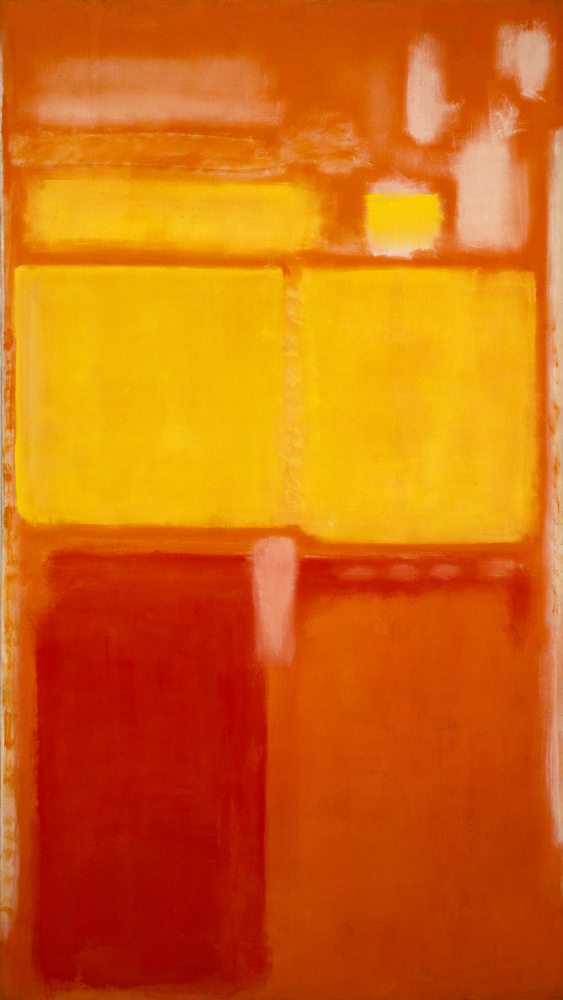

Mark Rothko, “No. 21” (1949). © 1998 Kate Rothko Prizel & Christopher Rothko - Adagp, Paris, 2023.
3. 1949: the kickoff of the “great classics”
The year 1949 marked a deep turning point in Mark Rothko’s career. At that time, the artist began painting his “classics” – total pictorial abstractions entirely composed of colored rectangles and blurred lines. The painter decided to remove the frames and to title his paintings with numbers. Canvas No. 21 is a good example of this paradigm shift. Here the viewer witnesses the intense, vivid, warm splashes of red, orange, yellow colors that were already emerging in his previous paintings, the so-called “Multiforms”. Yet, they draw vertical and horizontal strips of various sizes this time.
We can also spot the influence of L’Atelier rouge (1911), a painting by Henri Matisse that Mark Rothko deeply appreciated and discovered that same year at the MoMA. The color intensity and lines drawn by the objects and paintings pictured generate quite abstract forms. Still affiliated with the American Abstract Expressionism movement at the time, from which he would eventually separate, Mark Rothko’s work offers an in-depth reflection on the essence of painting and a desire to start his representation of reality from scratch. Soon, the number of rectangles would diminish, giving way to only two or three strips stacked vertically on top of each other, each more refined than the last. Omnipresent in this specific work, the color yellow would be increasingly rare in the artist’s canvases over the years.
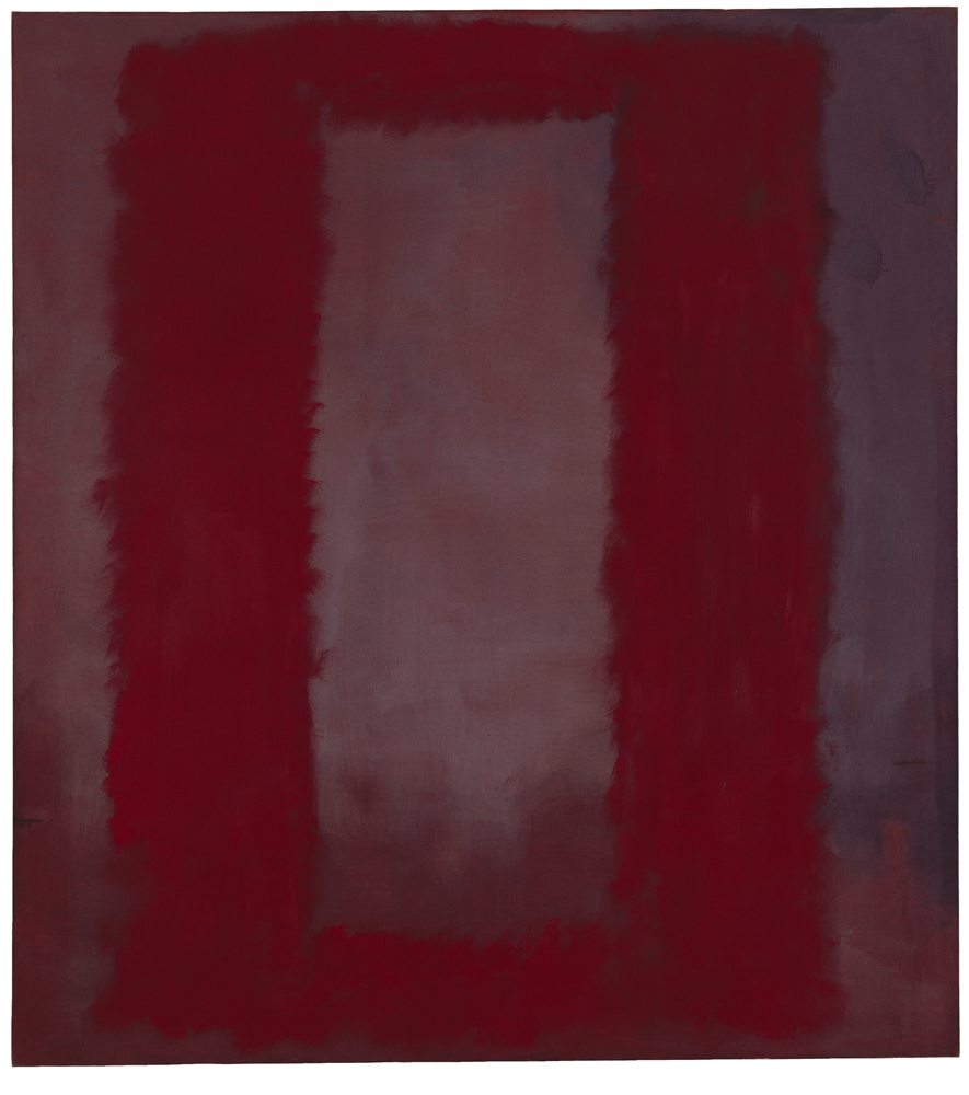

Mark Rothko, “Red on Maroon” (1959). © 1998 Kate Rothko Prizel & Christopher Rothko - Adagp, Paris, 2023.
4. The Seagram Murals: in-depth painting
From the early 1950s to the late 1960s, Mark Rothko’s work evolved in his relentless quest for the absolute. The artist applied fewer layers to his canvas, used darker colors and larger formats. The aim was to “envelop” the viewer to create a much more intimate relationship with the painting. That evolution translated into his Seagram Murals. In 1958, the Seagram distilleries commissioned him to paint the walls of the Four Seasons restaurant in their New York headquarters skyscraper. Judging that his usual bright color palette would be too intense for the customers coming for lunch, the artist opted for a range of purple, violet, brown, and burgundy tones to create an impression of depth in his immense canvases.
“These darker colors slowly penetrate your consciousness,” Christopher Rothko says. “These are not colors that call you, but rather get under your skin, colors that you can’t ignore”. When he returned to dine at the Four Seasons later on, Rothko hated the experience. He thought the restaurant was too pretentious, to the point of terminating his current commission and refunding the rest of the money he had been given. In 1969, he decided to donate nine of the Seagram Murals to the Tate in London, as a tribute to painter J. M. W. Turner. An entire room is now devoted to the paintings in the permanent collections of the Tate Modern.
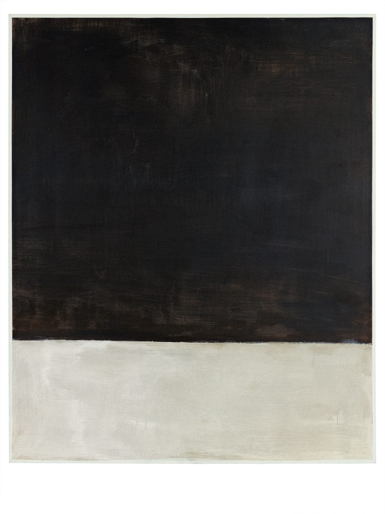

Mark Rothko, “Untitled (Black and Gray)” (1969). © 1998 Kate Rothko Prizel & Christopher Rothko - Adagp, Paris, 2023.
5. Rothko and Giacometti: the meeting that should have taken place
Many people reduce Mark Rothko’s 1969 Black and Gray series to a collection of canvases whose sad black and grey hues foreshadowed the painter’s suicide the following year. Yet, these works were above all a meticulous stylistic exercise. When the UNESCO commissioned him paintings for their headquarters in Paris, the American artist learned that his works would be exhibited alongside a sculpture by Alberto Giacometti and began to meticulously study his counterpart’s work. Rothko’s palette of black, brown, white, and grey tones was seemingly based on the colors used by the Swiss sculptor in his artworks.
Although he eventually refused the commission because of his fragile health condition after he suffered from an aneurysm, the American painter continued his series inspired by Giacometti. Just like him, the sculptor “encompasses all the solitude of the human soul,” Christopher Rothko comments. Untitled (Black and Gray) mirrors that complexity. While the lines of the two colored rectangles are clearly defined for once, their black and grey tones appear to be much richer and warmer than we might think, thanks to a secret mixture of various colors. The thin white line, a new feature in the artist’s work, also emerges to frame the canvas. The artwork seems to illustrate one of his most famous quotes: “My art is not abstract, it lives and breathes”.
Mark Rothko, exhibition open until April 2nd, 2024, at the Fondation Louis Vuitton, 16th arrondissement of Paris.
Translation by Emma Naroumbo Armaing.
