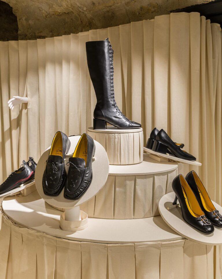
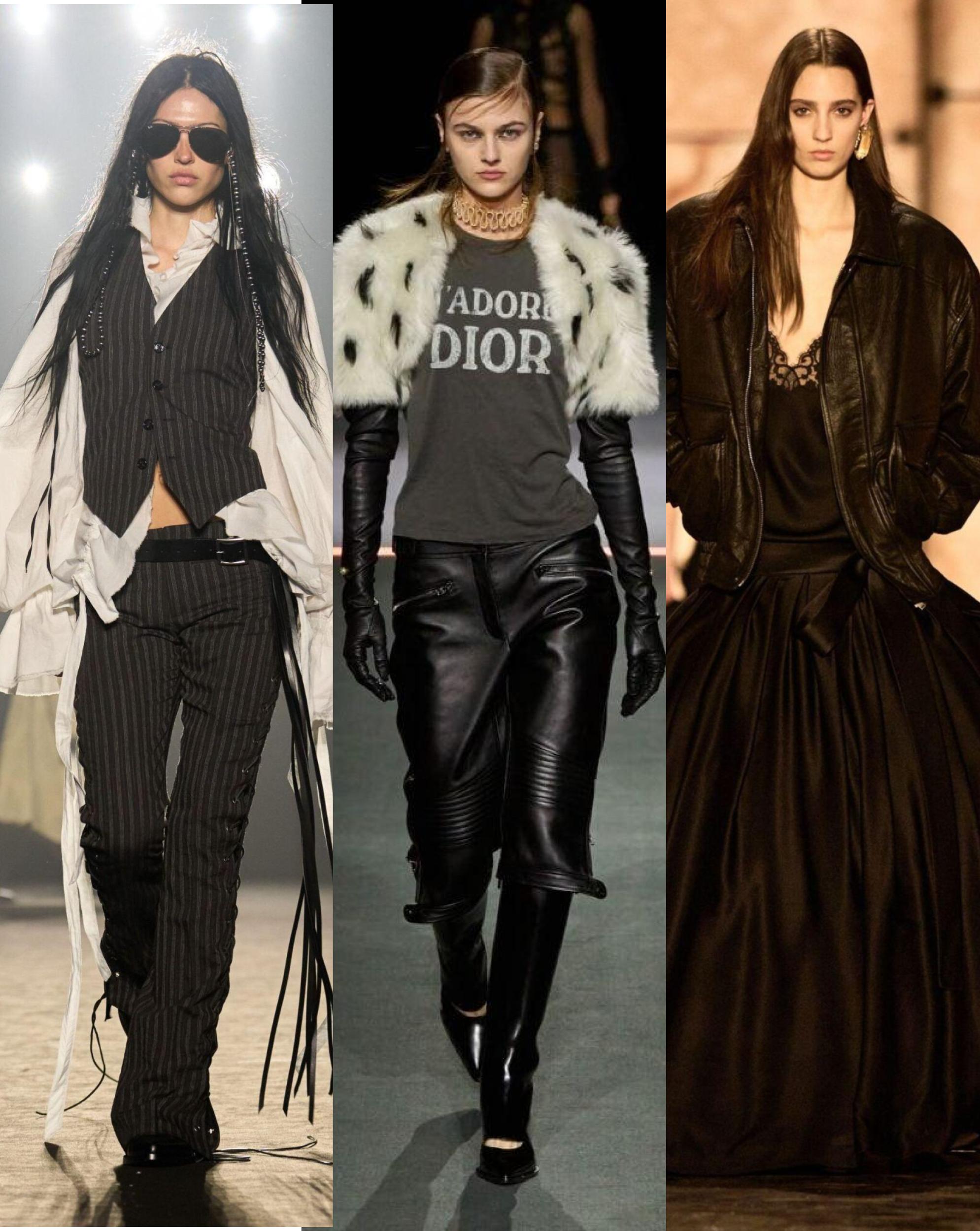
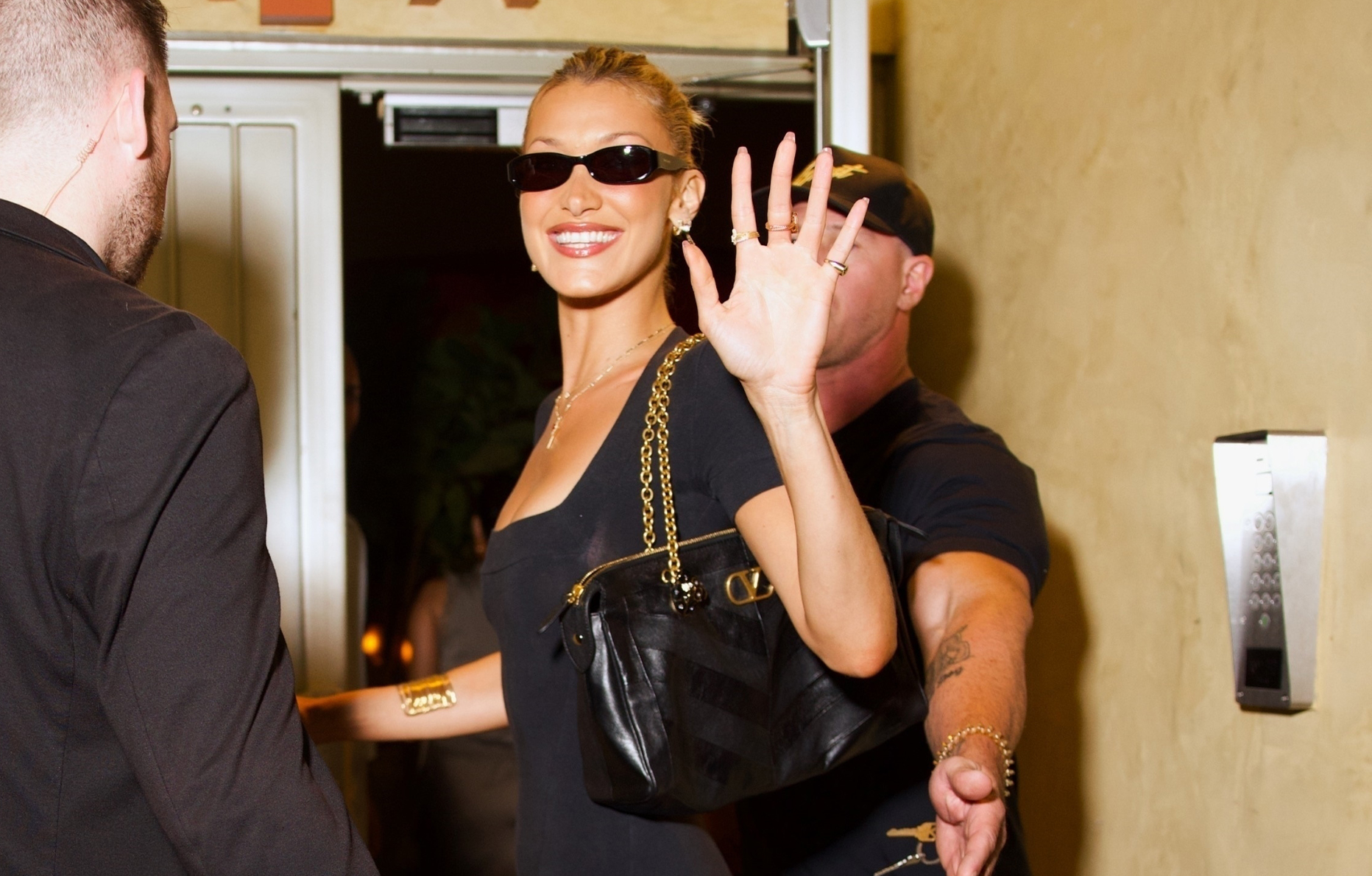
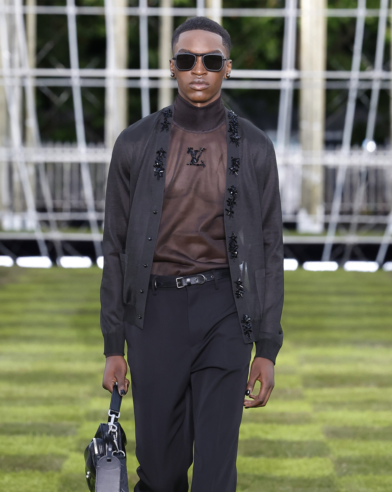
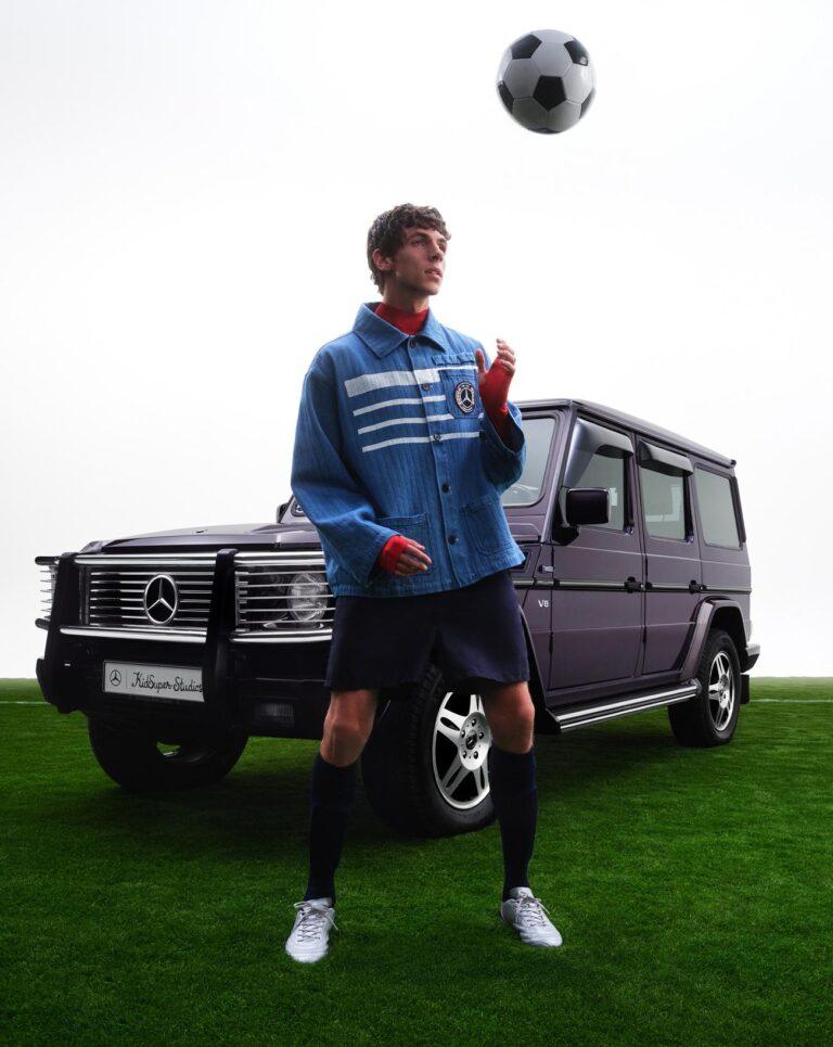
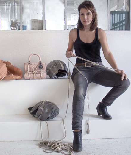
47


Order now
Numéro
09 Valentino red, Hermès orange, Fendi yellow: when fashion shows its true colours

Valentino red, Hermès orange, Fendi yellow: when fashion shows its true colours

FASHION

Valentino red, Fendi yellow, Schiaparelli’s “shocking” pink and Margiela’s white: so many fashion houses have made a colour their emblem, sometimes even inscribing it in the collective subconscious. We look back at the history of the six most famous shades in contemporary fashion.

  • Schiaparelli collection haute couture printemps-été 2020

    Schiaparelli collection haute couture printemps-été 2020 Schiaparelli collection haute couture printemps-été 2020
  • Valentino collection printemps-été 2020

    Valentino collection printemps-été 2020 Valentino collection printemps-été 2020
  • Valentino collection haute couture 2019

    Valentino collection haute couture 2019 Valentino collection haute couture 2019
  • Valentino collection haute couture printemps-été 2020

    Valentino collection haute couture printemps-été 2020 Valentino collection haute couture printemps-été 2020
  • Hermès collection automne-hiver 2019-2020

    Hermès collection automne-hiver 2019-2020 Hermès collection automne-hiver 2019-2020
  • Schiaparelli collection haute couture automne-hiver 2018-2019

    Schiaparelli collection haute couture automne-hiver 2018-2019 Schiaparelli collection haute couture automne-hiver 2018-2019
  • Yohji Yamamoto collection automne-hiver 2020-2021

    Yohji Yamamoto collection automne-hiver 2020-2021 Yohji Yamamoto collection automne-hiver 2020-2021

1/7

Why do we immediately think of red when we think of Valentino? How did yellow become Fendi's flagship colour? What significance does white have in the history of the House of Margiela? These questions confirm that beyond the logo, cult clothes and accessories, a fashion label very often uses colour to inscribe its signature on the collective subconscious. More immediate than a name, a font or a drawing, appearing on the garments, in the campaigns but also as packaging, colour catches the eye and resonates in our mind even before we’re aware of it. In fact, some houses are so familiar with this visual vocabulary that a colour alone conjures up their name, like the fired orange that now rhymes with Hermès. But behind these emblematic shades lie hidden anecdotes, chance encounters and intimate obsessions, or even the explicit development, as in Yohji Yamamoto's work with black, of a real philosophy. Numéro deciphered six of them.

Sac Peekaboo IseeU East-West en cuir jaune

Sac Peekaboo IseeU East-West en cuir jaune

Collection Fendi automne-hiver 2020-2021

Collection Fendi automne-hiver 2020-2021

1. Fendi: yellow, a welcome light


Since its establishment in 1925 in Rome, Fendi has specialised in bags and, above all, in fur. And while the Italian company has been making a name for itself throughout the world for almost a century, it brings with it a colour range characteristic of this rare natural material, varying between different shades of brown, beige, grey and red depending on the fur used. But some thirty years ago, a new colour was added to the Fendi vocabulary, which became its signature: a warm, dense yellow, between straw and buttercup. Inspired by the material known as pergamena - parchment, in Italian - which had swathed many trunks and suitcases in the 1930s, the colour first appeared discreetly on a few nylon and leather bag designs, before being adopted by the house packaging, then returning systematically to each accessory collection and inviting itself onto clothes with a certain audacity: for its fall-winter 2012 collection, Karl Lagerfeld and Silvia Venturini Fendi unveiled a colourful fur coat swathed in this scintillating yellow. More recently, for the men's fall-winter 2020-2021 season, the house's artistic director transformed the now legendary rigid paper shopping bags and Fendi cardboard boxes into exceptional leather accessories, all dyed in this emblematic colour. 

Hermès collection automne-hiver 2019-2020

Hermès collection automne-hiver 2019-2020

Boîtes Hermès. Photo : Quentin Bertoux.

Boîtes Hermès. Photo : Quentin Bertoux.

2. Hermès: orange, a happy coincidence


Today, Hermès is indissociable from orange. However, the original intentions of the house were far from this warm and luminous colour. In the 19th century, Emile-Maurice Hermès wanted to make brown his signature colour, echoing the leather for which its products are famous: in the 1920s, the first Hermès boxes were therefore made in a beigey-brown fine grain paper in order to respect this heritage. Then came the Second World War. Faced with restrictions in the supply of its materials, Hermès was forced to choose the only colour available at the time for its cardboard packaging: orange. Little by little, from the ribbons to the boxes they decorated, the colour became as cult as the house's famous emblematic horse, and is often mixed with the brown of its exceptional leathers. Today, Hermès orange is used to decorate nearly 900 different sizes of boxes, from the smallest to the largest, from the roundest to the most square, to the point that these containers themselves have become cult objects sold at high prices on the second-hand market. As for the clothes, they occasionally welcome a touch of orange, such as this elegant fine wool turtleneck presented in the autumn-winter 2019-2020 collection.


Final du défilé Valentino haute couture printemps-été 2008. Final du défilé Valentino haute couture printemps-été 2008.
Final du défilé Valentino haute couture printemps-été 2008.

3. Valentino: red, a veritable obsession


"Red is a fascinating colour: it is life, the blood of death, passion, love, the ultimate remedy for sadness and gloom". A perfect summary in the words of Mr. Valentino Garavani, father of the famous fashion house that has carried his name since 1959. For in the eyes of the Italian designer, the power of red is rooted in the intimate story of a true aesthetic emotion. As a student in Barcelona, the young man went to the Opera one evening where he saw, in a dressing room, an elderly woman whose beauty caught his attention. Why? The contrast between the grey of her hair and the deep red of her velvet dress, a hue worn by numerous other spectators that night. From then on, the colour entered the vocabulary of his imagination and his collections, where it has been synonymous with femininity, fatality and strength for the decades since. We even speak of "Valentino red" to describe this poppy-coloured hue, which can be draped around the body, in a matt or satin finish, plain, pleated or embroidered, transparent or opaque. At the beginning of 2008, Valentino Garavani retired from the artistic direction of his house: for the finale of his last haute couture fashion show, the designer came out to greet his models who were all dressed in the same asymmetrical fitted red dress cinched beneath the bust. A poetic way to say goodbye while letting the eternal colour blossom in the hands of his successors, Maria Grazia Chiuri and Pierpaolo Piccioli. 


Elsa Schiaparelli, cape “Phoebus” issue de la collection “Cosmique” de l’hiver 1938-1939.  Broderies de la maison Lesage. Dessin de Christian Bérard

Elsa Schiaparelli, cape “Phoebus” issue de la collection “Cosmique” de l’hiver 1938-1939. Broderies de la maison Lesage. Dessin de Christian Bérard

Schiaparelli collection haute couture automne-hiver 2019-2020.

Schiaparelli collection haute couture automne-hiver 2019-2020.

4. Schiaparelli: pink, an audacious choice


Shocking was the name Elsa Schiaparelli bestowed upon the fuchsia pink which would become so characteristic of her creations. In 1936, nine years after opening her own fashion house in Paris, the Italian designer was searching for the fabrics that would make up her next collection when her attention was drawn to a bright pink. “The colour flashed before my eyes,” she recalled in 1954. “Brilliant, impossible, brazon, becoming, invigorating, like all the birds and fish of the world combined, a colour from China and Peru but not from the West. A shocking colour, pure and undiluted." Very quickly, pink swept over the dresses of the house, with the eccentric and joyful spirit it radiated at the dawn of the Second World War: in 1938, it was notably found on a sumptuous terry cloth cape embroidered by the house of Lesage with golden sequins, shards and metallic threads forming a sun with a human face. The designer even went so far as to tint her 1937 perfume named "Shocking" in pink, as a tribute to her characteristic colour. Today, Daniel Roseberry, Schiaparelli's artistic director for the past two years, has decided to take on this founding element of the company, which he describes as "very modern" and indicative of Elsa Schiaparelli's contribution to fashion. "We are gradually going to start exploring Shocking pink in new and perhaps even shocking ways". Unveiled a fortnight ago in his new haute couture collection, a short pink dress entirely embroidered with glass tubes on a mould with exaggerated musculature seems to have already taken this step.

Image issue de la campagne de la collection capsule “Tabi” par Maison Margiela. Photo : Rebecca Storm

Image issue de la campagne de la collection capsule “Tabi” par Maison Margiela. Photo : Rebecca Storm

Maison Margiela, collection printemps-été 2009 © Etienne Tordoir

Maison Margiela, collection printemps-été 2009 © Etienne Tordoir

5. Maison Margiela: white, a sign of belonging


From Paris to Tokyo and Shanghai, you only have to step into a Margiela boutique to see that white is the signature colour of the label founded by Martin Margiela in 1989. Behind the Palais Royal in the French capital, for example, it can be seen immediately on the painting of the stacked tyres that frame the shop door to the bookshop at the back of the room, the clothes rails and even the billiard table on which clothes are displayed. It is in this same white that the Belgian designer has been repainting his upcycled clothes and even his famous tabi shoes since the 90s, always with a view to making a clean sweep of what already exists and giving it a unique texture. In the house's ateliers, this aesthetic bias is taken to a new level: all the walls and the raw furniture match this supreme colour and while the seats aren’t, they are swathed with an immaculate cover. As for the employees, every day they all wear a white coat, reminiscent of a lab coat. And when some of them stepped out in public for the spring-summer 1998 collection in a most memorable fashion show, they all wore this uniform, which has both a practical and symbolic function, embodying, like the masks worn by the models, the desire for invisibility that Martin Margiela sought from the very beginning. As Olivier Saillard writes, "to the cultivated and overexposed 'I', he prefers the anonymity of the white jacket that everyone in his house wears with pride of belonging". The ultimate proof are the four white threads visible on the back of every Margiela garment, a way of surreptitiously signalling a label that only those in the know recognise...

Yohji Yamamoto collection homme printemps-été 2021

Yohji Yamamoto collection homme printemps-été 2021

Yohji Yamamoto collection femme printemps-été 2021

Yohji Yamamoto collection femme printemps-été 2021

6. Yohji Yamamoto: black, a clothing philosophy


If there is one colour that has been used by every single fashion designer, it has to be black. Prized for its timeless elegance, its adaptability, its luxury quality, its depth, its dark and melancholic resonances, it returns each season in the majority of clothing and accessory collections, where it plays a more or less discrete role until it reigns supreme. In spite of this trend-free success, no one has exploited black quite like Yohji Yamamoto. Since the launch of his label in 1972, the Japanese designer has made it his favourite colour, generating a genuine aesthetic motto. It was his mother's dark and sober wardrobe, in mourning after the death of her husband, and the experience of urban life in the heart of Tokyo - whose myriad of colours, lights and visual frenzy incited a sense of purity - that shaped the young man's imagination in the 1940s and 50s. His first creations were black T-shirts that he wore proudly in the capital city as a sign of protest against the economic boom. Often enveloping, the pieces he later imagined use black to radicalise and essentialise the silhouette, to manifest a silent struggle between the body and the environment but also to blur the boundaries of gender. Fifty years after his official debut the designer continues to exploit black in all its glory, from his clothes to his visual identity, occasionally adding some colour... but "black always wins in the end", he says resignedly. "[It] can swallow light or sharpen things. But above all, black says ‘I don't bother you, so don't bother me either’."